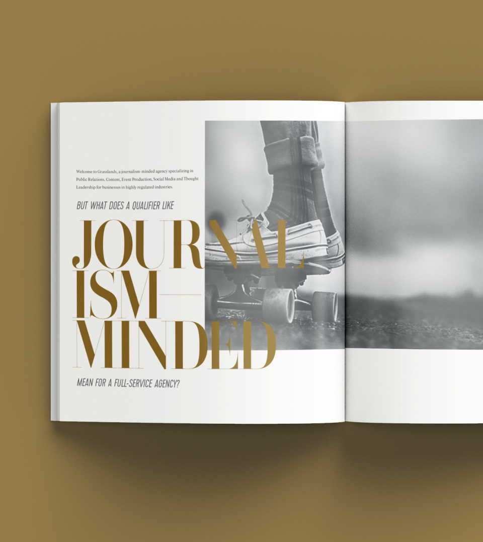
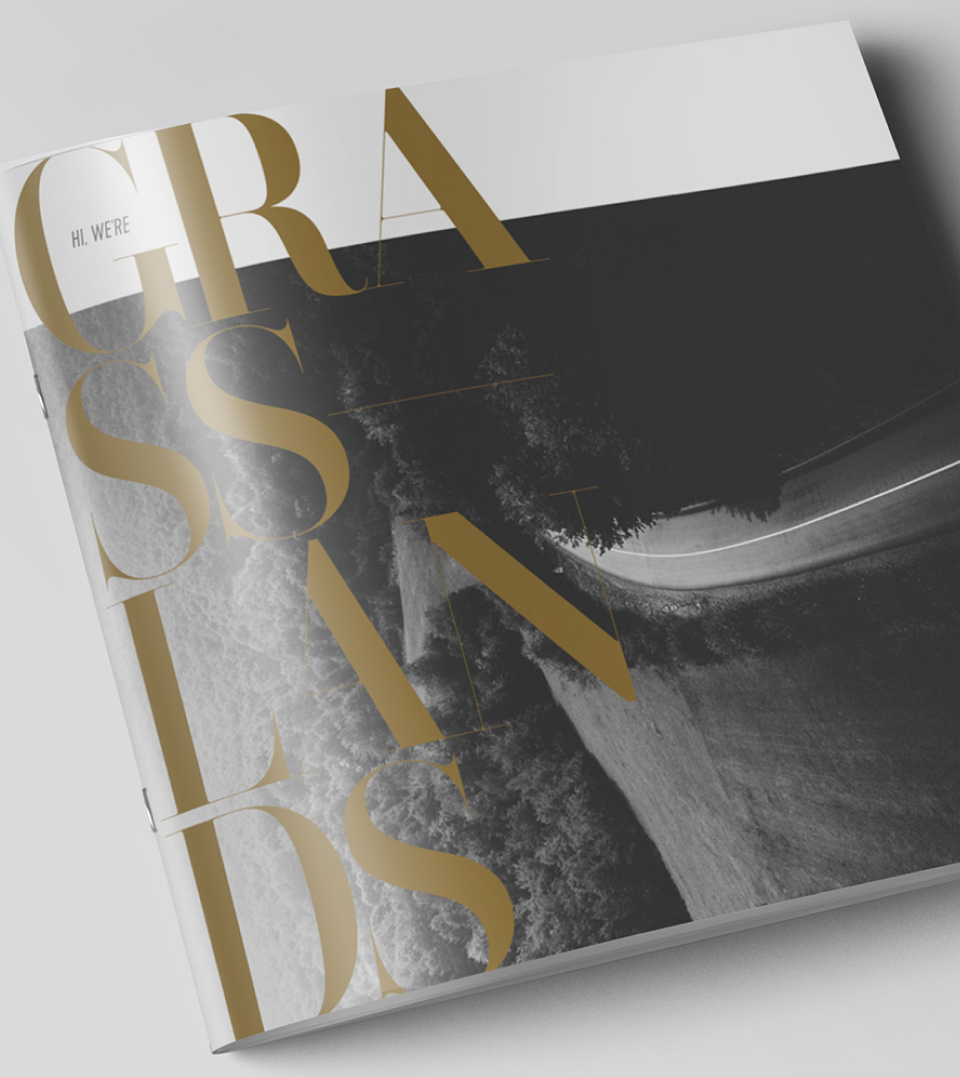
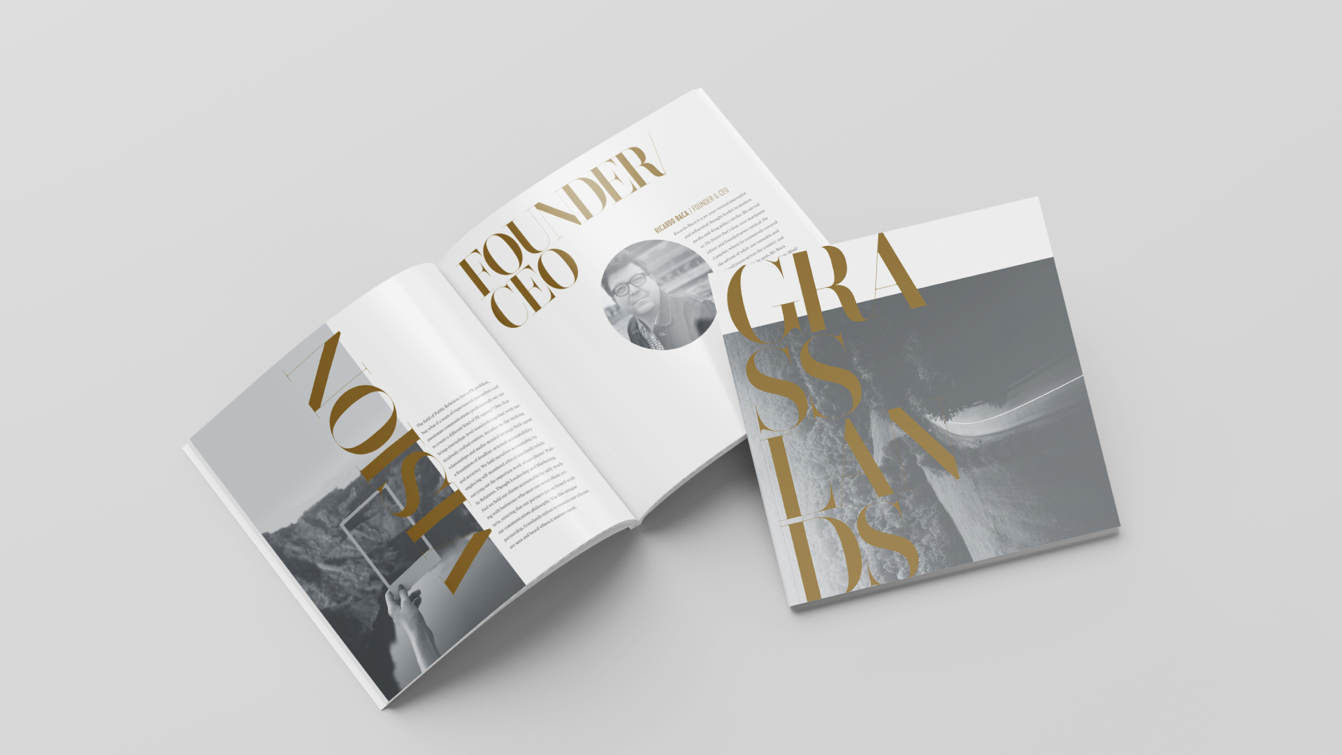
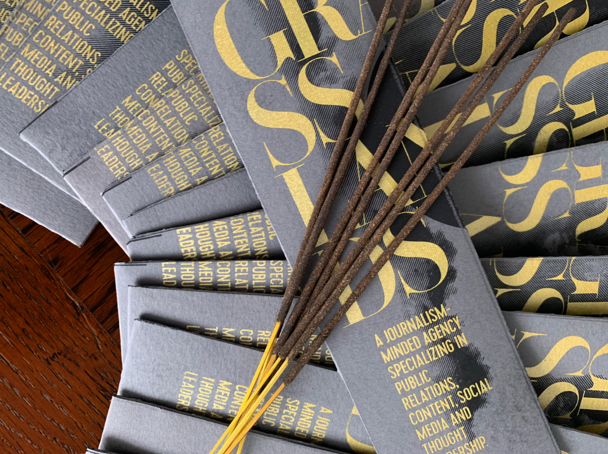
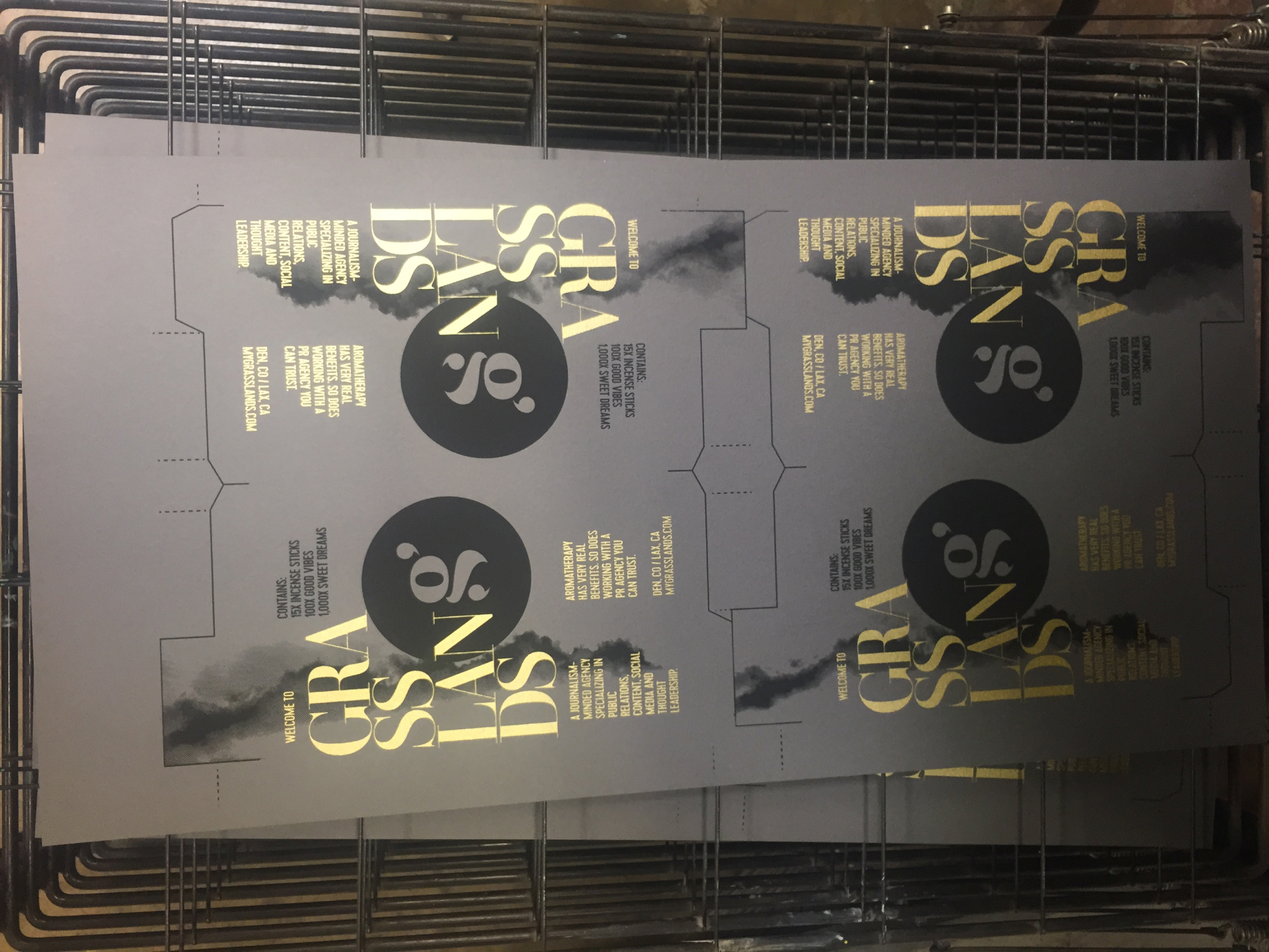
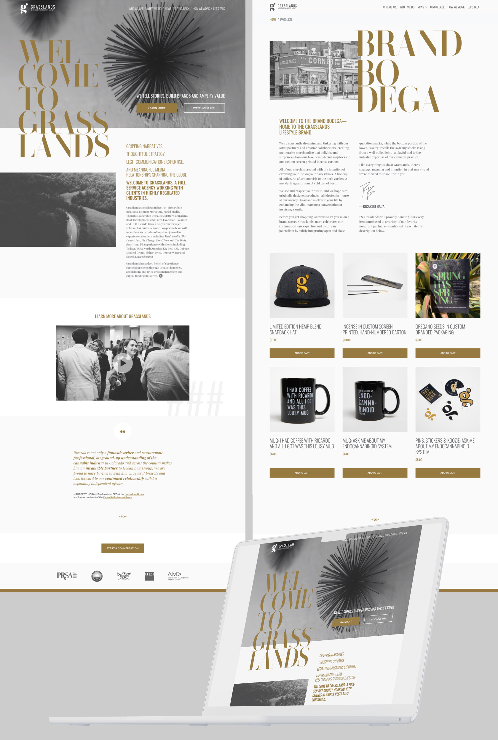
Branding a PR agency with a unique emphasis on journalism.

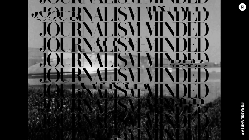
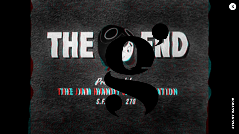
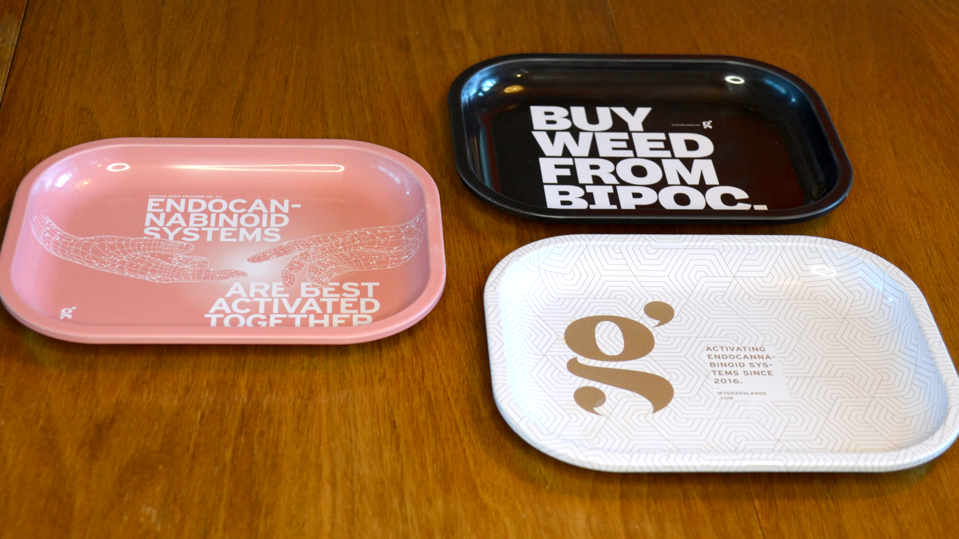
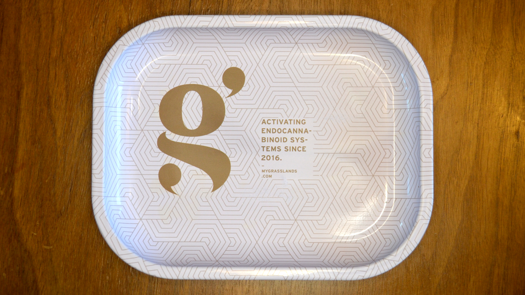
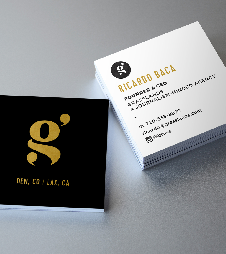
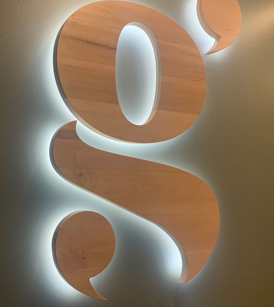
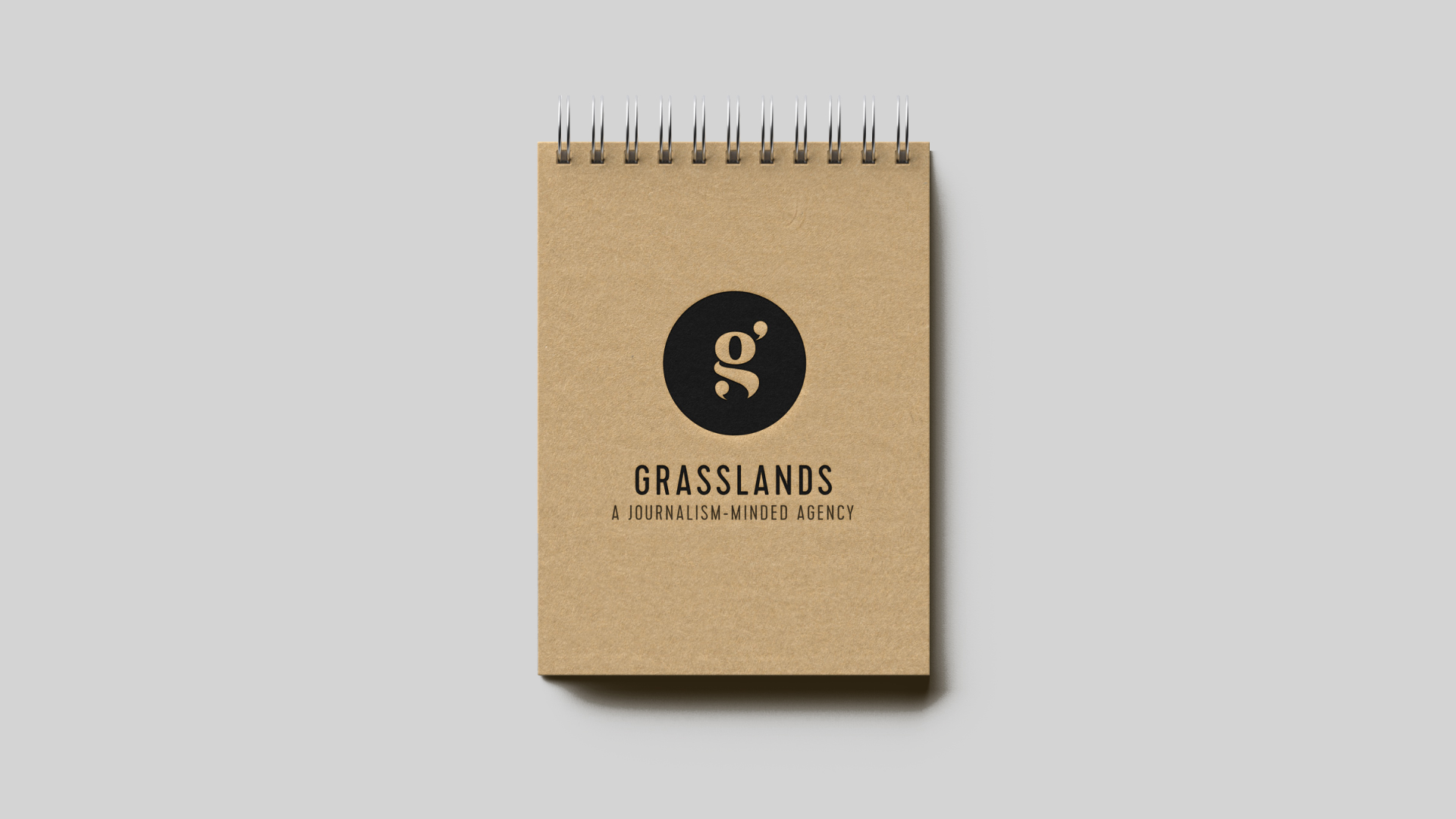
Grasslands loved the idea of repeating quotation marks in their letterform, as an ode to their journalism roots and as a way to capture their editorial integrity as they go forward into the realm of public relations and cannabis marketing.

Taking inspiration from their interdisciplinary journey, we wanted to emphasize layering intentional design details to elevate the intricacies of their brand story. 

Client:
Grasslands Agency

Striking examples from the capabilities brochure. We felt the piece should read like an art gallery program, with a similar level of austerity.

We had a lot of fun with the typography, allowing it to spill over edges and break unexpectedly. 
The abstract photography, cropped at unusual angles and given ample white space, helps underscore the playfulness.

Hand screenprinted incense packaging, black and gold

This long-looping piece is played at Grasslands Parties.

Found footage sourced from open license government footage. It’s obviously a little trippy.

Other projects:

Mindcare—Telepsychiatry gets a brand new, Swiss-inspired design system.
Mindful Health—Spearheading a comprehensive and progressive campaign for an emerging wellness brand.