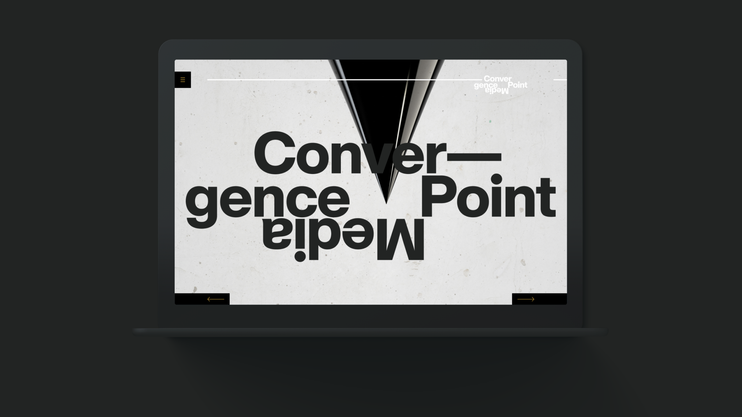
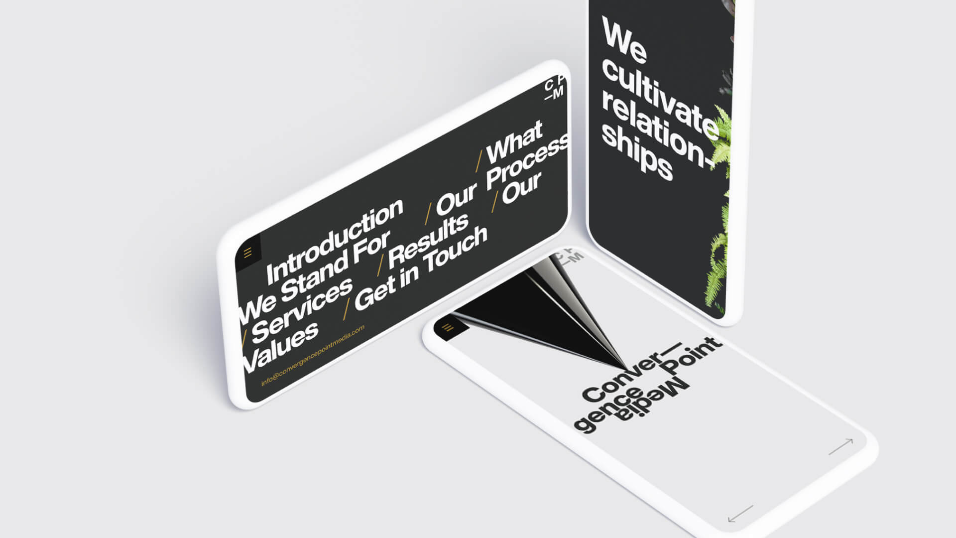
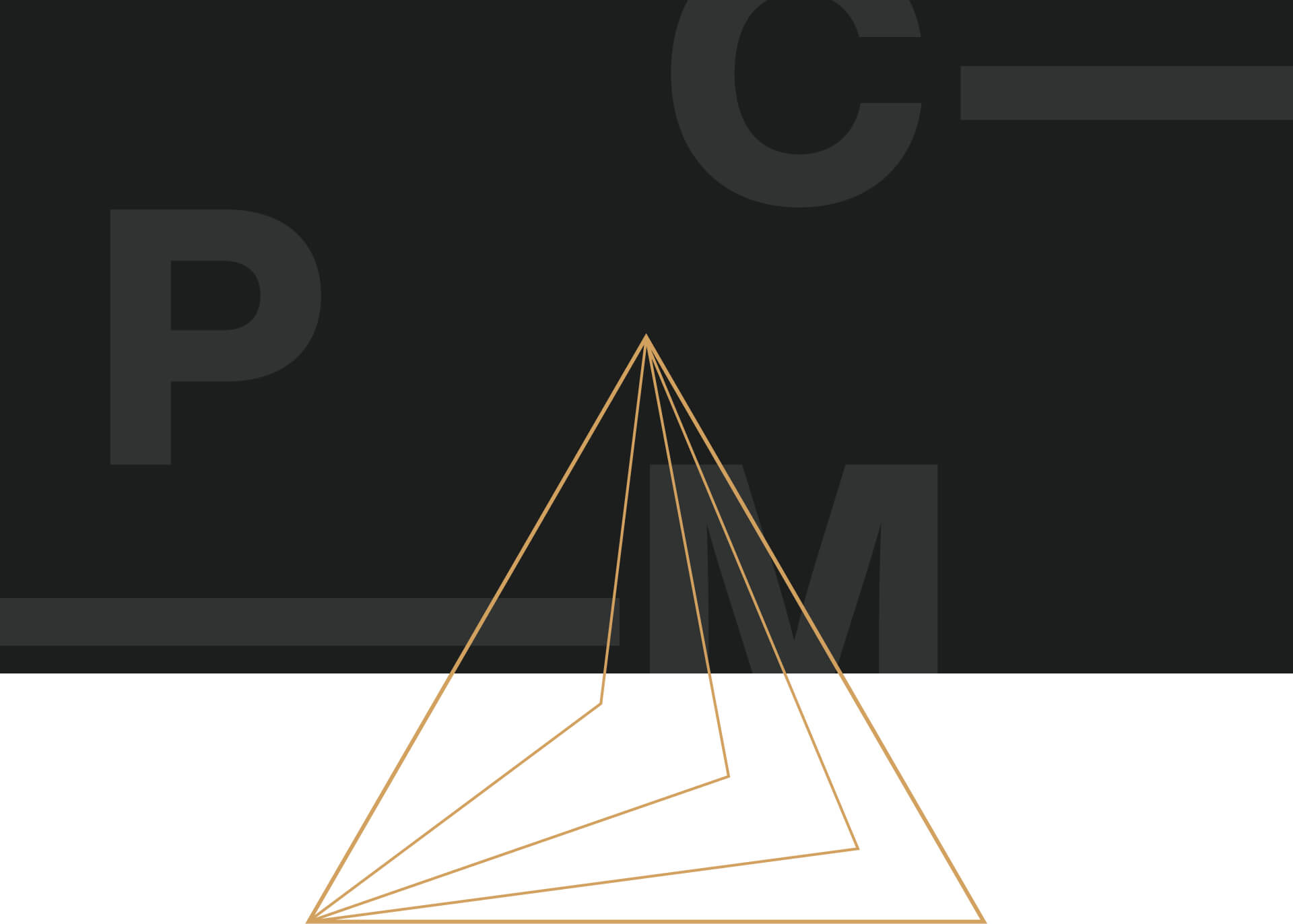
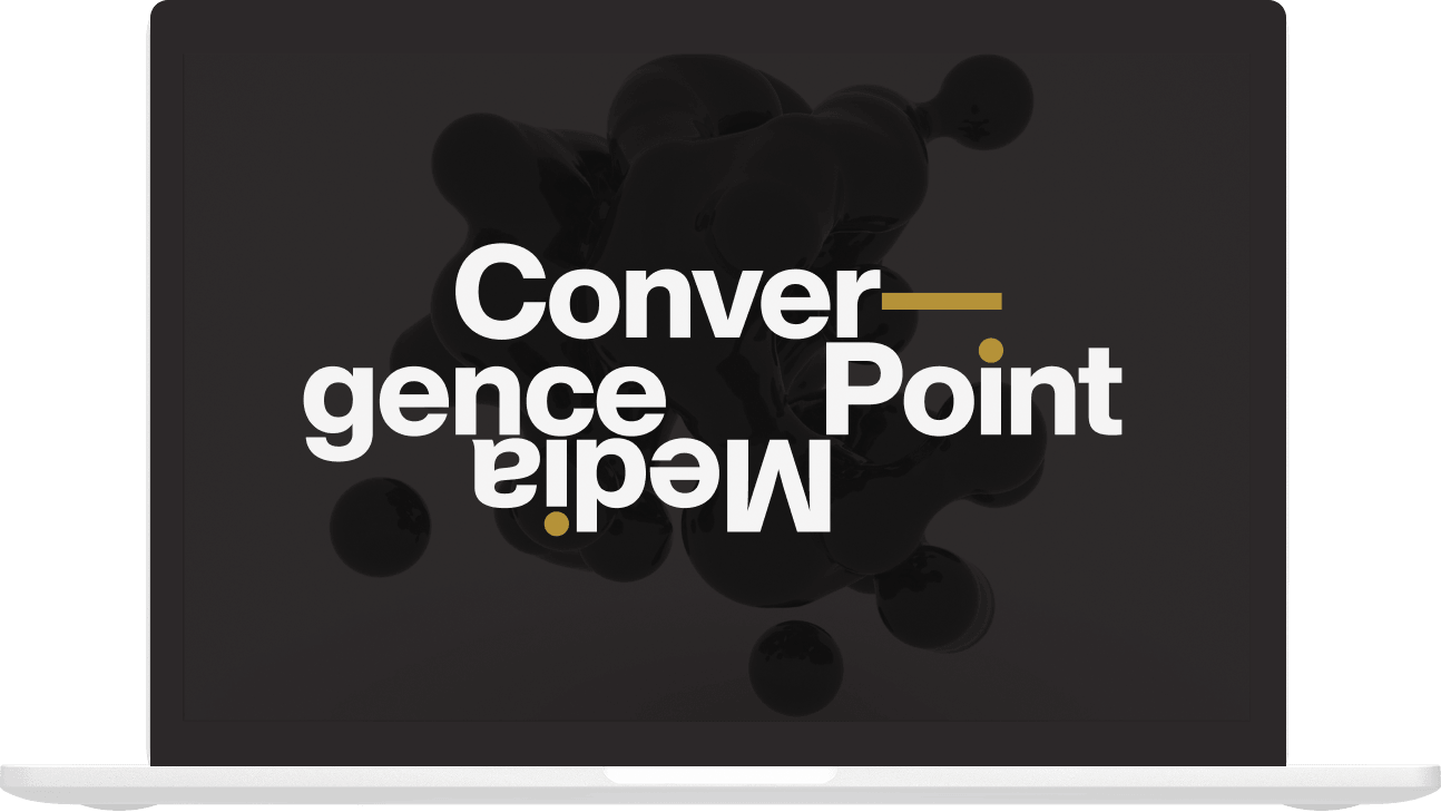
Convergence Point Media needed an identity that reflected its unconventional approach to creative collaboration. We developed a bold, typography-driven visual system that challenged traditional compositions through oversized letterforms, unexpected arrangements, and a distinctive graphic language.
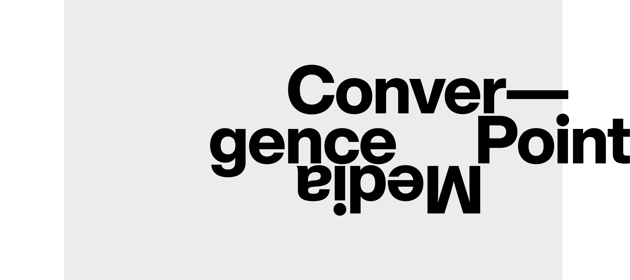
Built around a custom wordmark, the identity was designed to be expressive without sacrificing consistency, giving CPM a flexible foundation for everything from digital experiences and brand storytelling to print, motion, and marketing applications.
Typography as a visual system
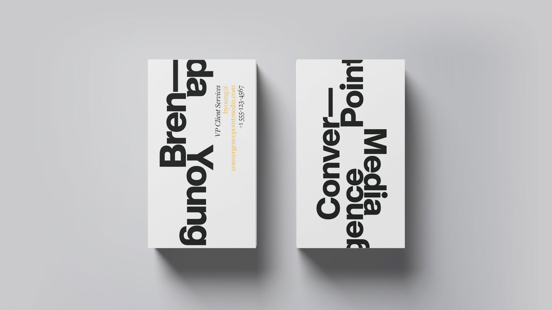
The custom wordmark became the foundation for a more expressive identity, with letterforms that could be enlarged, cropped, rotated, and rearranged across digital and physical applications. What began as a distinctive typographic signature evolved into a flexible visual language with its own recognizable personality.
Short animated brand statements explored how timing, fragmentation, and movement could give CPM’s typographic identity an added sense of rhythm and personality.
The identity extended beyond typography into a broader graphic language of geometric forms, repeating patterns, and unexpected compositions. Each element could stand on its own or work together as part of a cohesive visual system.