Following a comprehensive rebrand developed by an outside agency, I joined Sanas at an important moment in the company’s evolution. The foundation of a bold new visual identity was in place, but much of the work of bringing that identity into the world was still ahead. The challenge was to translate a compelling creative vision into a consistent, adaptable brand experience—one that could support the demands of a growing technology company across an expanding range of audiences, channels, and applications.
Working within Marketing, I took responsibility for the company’s in-house creative needs beyond core product design. My work spanned brand communications, digital experiences, presentations, printed materials, and motion, balancing hands-on execution with broader creative direction. Much of the role involved extending the visual language into situations the original identity system hadn’t explicitly anticipated, maintaining its character while giving it the flexibility to evolve.
I also worked closely with the product design team, providing creative direction and mentoring its primary designer. That collaboration offered opportunities to connect the brand and product experiences while respecting the distinct responsibilities of each team.
Bringing a new brand to life at scale.
Following a comprehensive rebrand developed by an outside agency, I joined Sanas at an important moment in the company’s evolution. The foundation of a bold new visual identity was in place, but much of the work of bringing that identity into the world was still ahead. The challenge was to translate a compelling creative vision into a consistent, adaptable brand experience—one that could support the demands of a growing technology company across an expanding range of audiences, channels, and applications.
Working within Marketing, I took responsibility for the company’s in-house creative needs beyond core product design. My work spanned brand communications, digital experiences, presentations, printed materials, and motion, balancing hands-on execution with broader creative direction. Much of the role involved extending the visual language into situations the original identity system hadn’t explicitly anticipated, maintaining its character while giving it the flexibility to evolve.
I also worked closely with the product design team, providing creative direction and mentoring its primary designer. That collaboration offered opportunities to connect the brand and product experiences while respecting the distinct responsibilities of each team.
A new identity is only the beginning.
The challenge is making it work everywhere.
An extensive rebrand had established the visual foundation for Sanas. My responsibility was to help translate that foundation into a working system, one that adapts to different audiences, formats, and business needs without losing the character of the original identity.
That meant looking beyond individual applications to establish consistency in how the brand was used, interpreted, and extended. From the smallest details to high-visibility experiences, every decision needed to feel part of the same visual language.
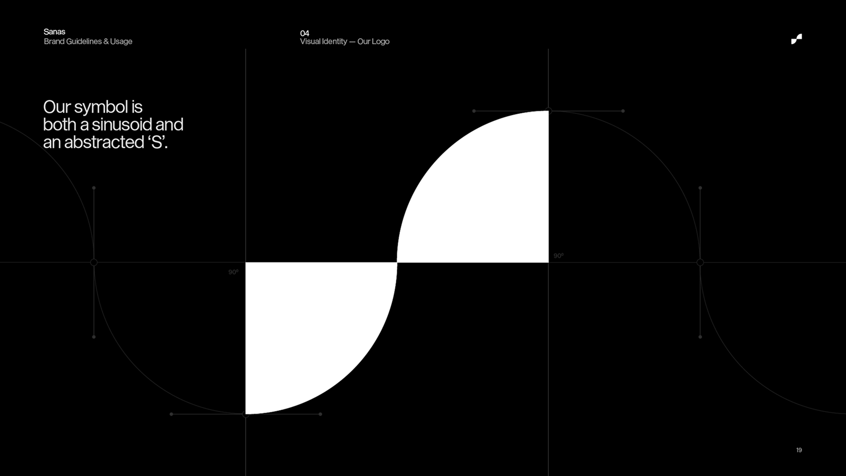
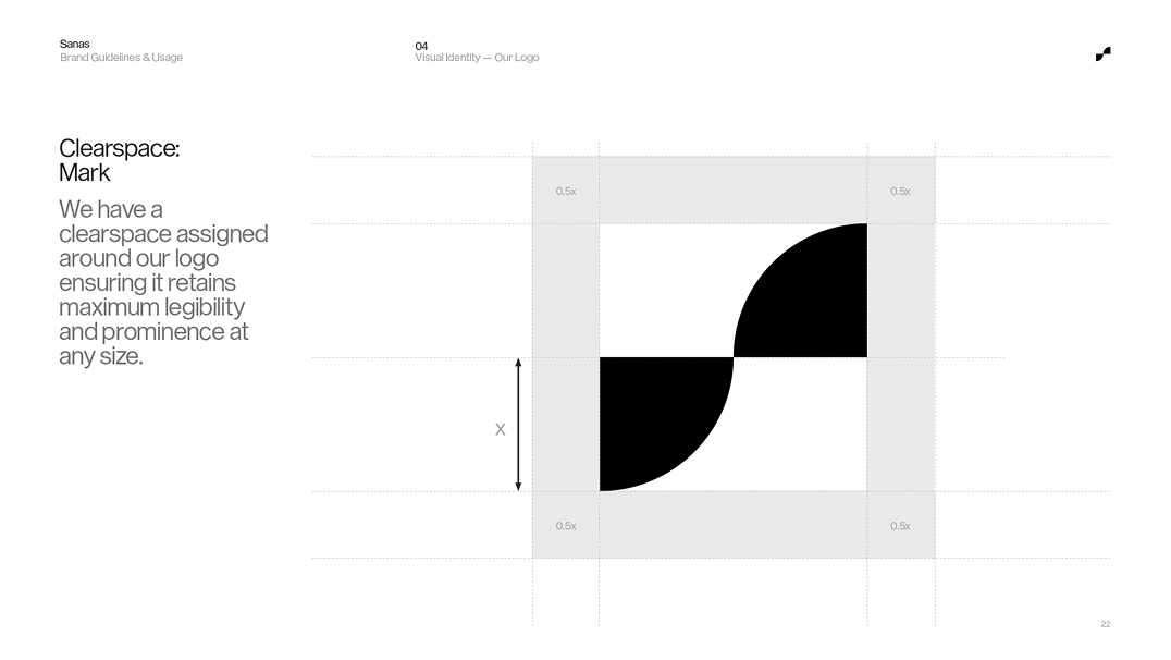
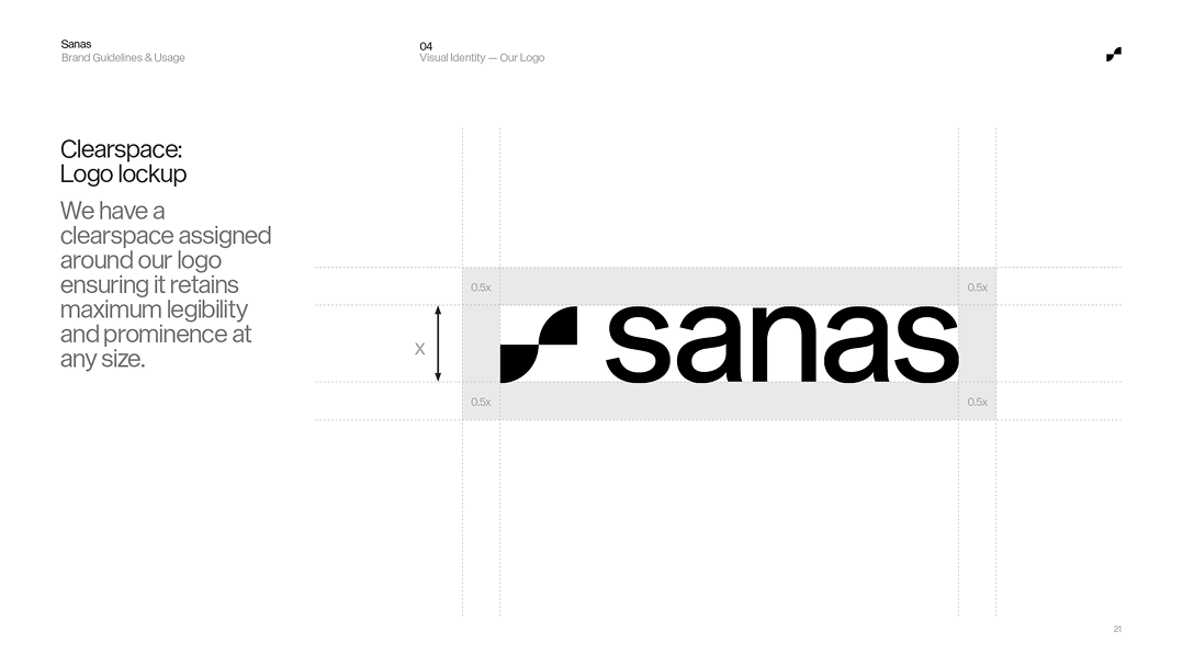
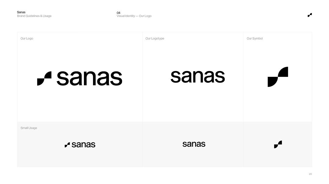
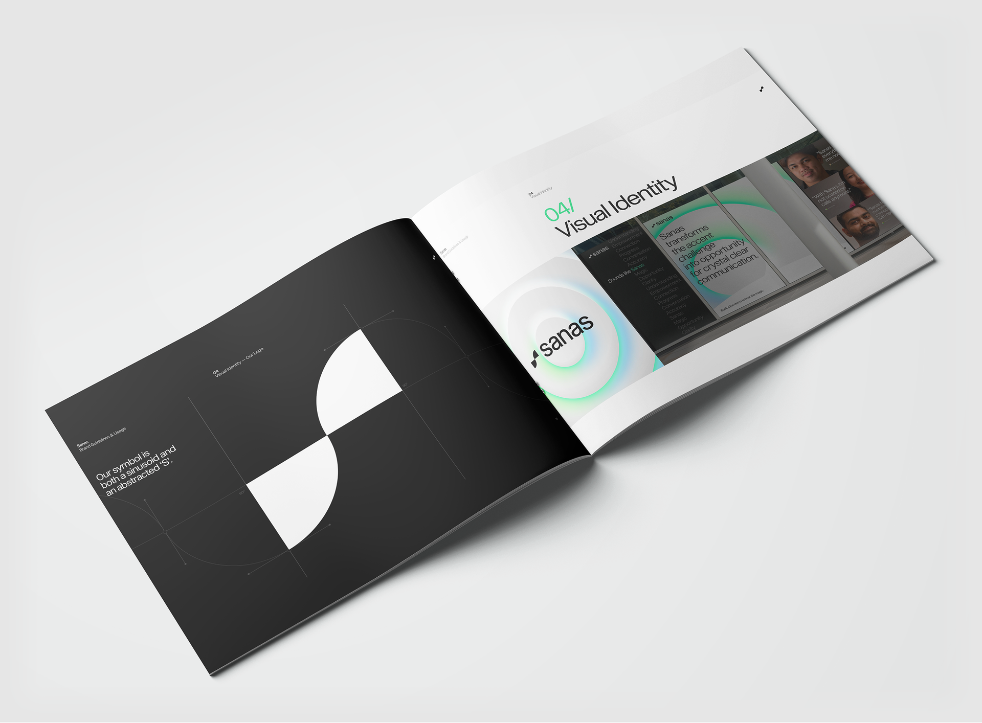
Identity foundations including the Sanas symbol, wordmark, clearspace and usage specifications
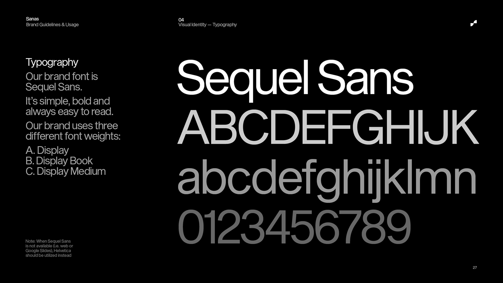
Brand typography specs and hierarchy
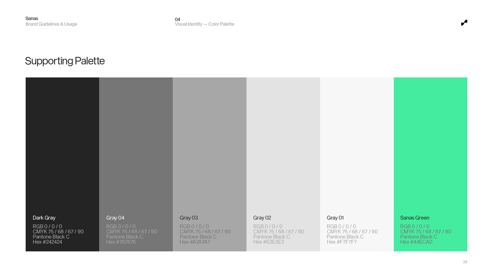
Color system utilizing black and white foundation, supporting neutrals and Sanas Green
A brand only scales when everyone knows how to build with it.
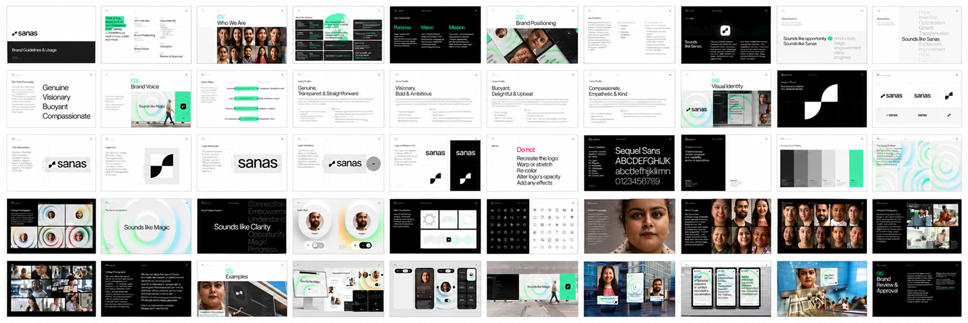
To support the growing range of people and partners working with the Sanas identity, I developed a comprehensive, 50-page Brand Guidelines & Usage document. Bringing together the brand’s strategic foundation, visual specifications, tone of voice, photography direction, graphic devices, and real-world applications, the document established a shared reference for creating work with greater consistency and confidence.
Beyond documenting the existing identity, the goal was to make it practical: clarifying how individual elements should behave, providing examples of their application, and creating guidance for situations beyond the original rebrand. The result was a resource designed to support creative decisions across teams without limiting the brand’s ability to evolve.
Brand Guidelines & Usage documentation (50 pages). A comprehensive reference for the identity’s strategic, verbal and visual expression.
Selected spreads showing logo usage, typography, photography, graphic devices and application examples.
From pixels to physical spaces
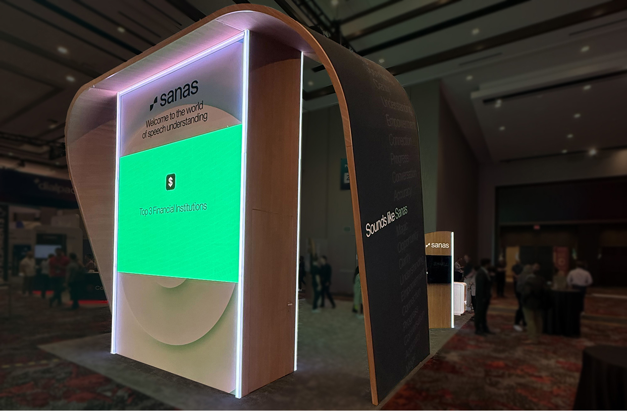
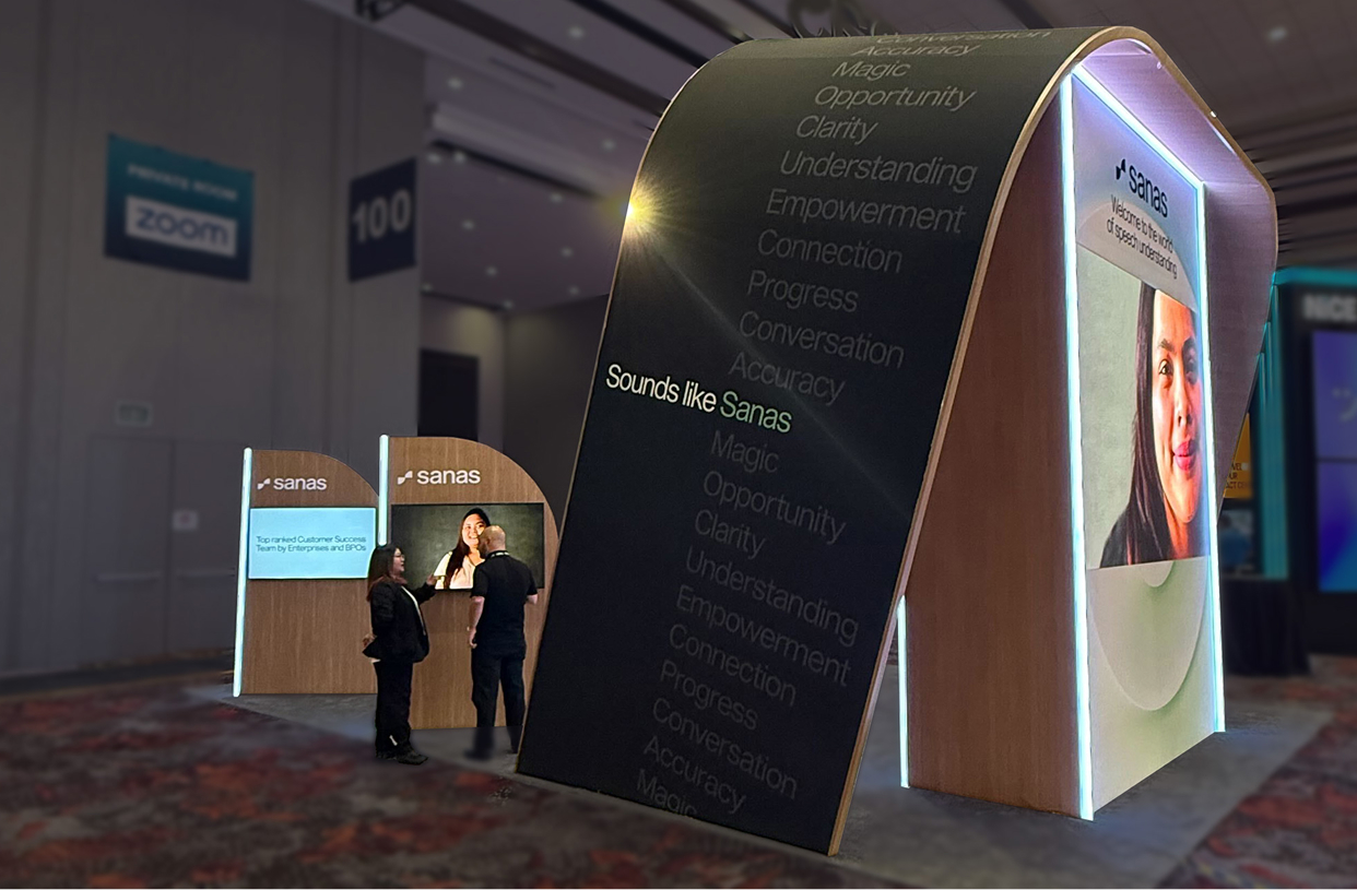
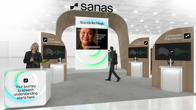
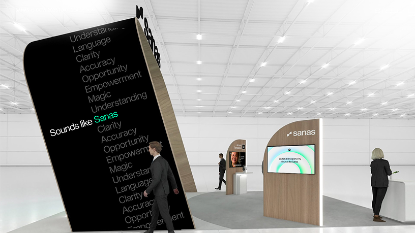
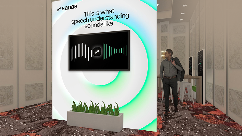
Extending the identity into a physical environment introduced an entirely different set of creative considerations. I helped translate the Sanas visual language into a cohesive trade show presence, developing brand applications across large-format environmental graphics and digital displays.
The work needed to communicate clearly at a distance, feel coherent throughout the space, and retain its visual impact across both static and animated formats. It was an opportunity to bring multiple expressions of the brand together within a single, shared experience.
Sanas trade show presence, environmental branding, booth graphics and animated sequences.
LED wall and display animations we directed and produced for the exhibition environment.
Giving complex technology a story people can follow.
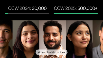
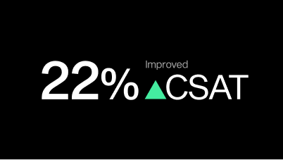
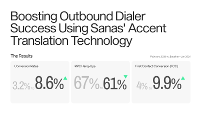
Explaining what Sanas technology makes possible often required more than static visuals. For an enterprise sales presentation, I developed the storyboards and provided art direction for an animated piece designed to make the product’s capabilities more tangible and engaging.
My focus was on shaping the visual narrative, establishing how the story would unfold, identifying the moments that needed emphasis, and guiding the creative execution from initial boards through the finished animation.
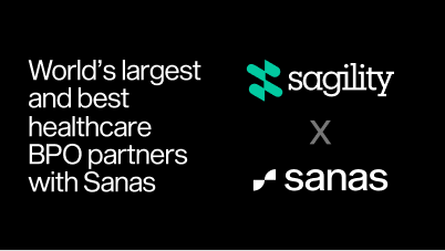
Animated partnership piece: Concept development, storyboarding and art direction
Selected storyboards showcasing the visual sequencing and narrative direction developed ahead of animation.
Designing for what's next, not just what's needed now.
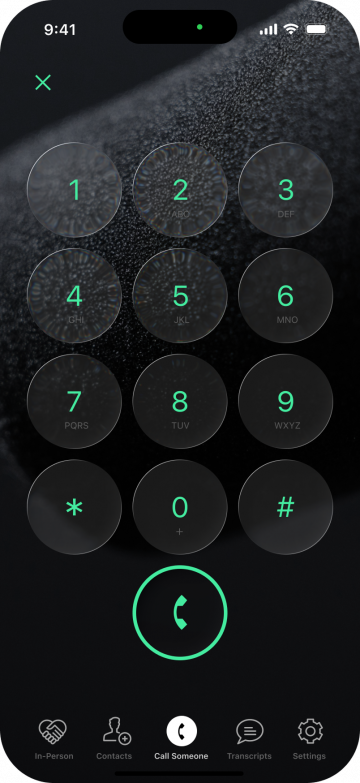
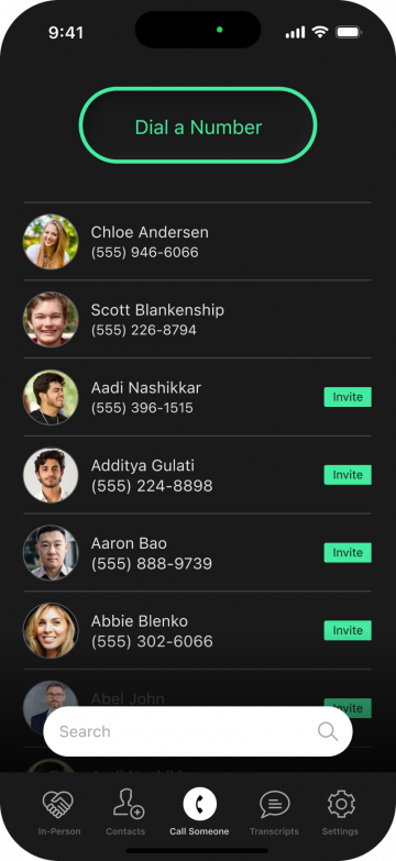
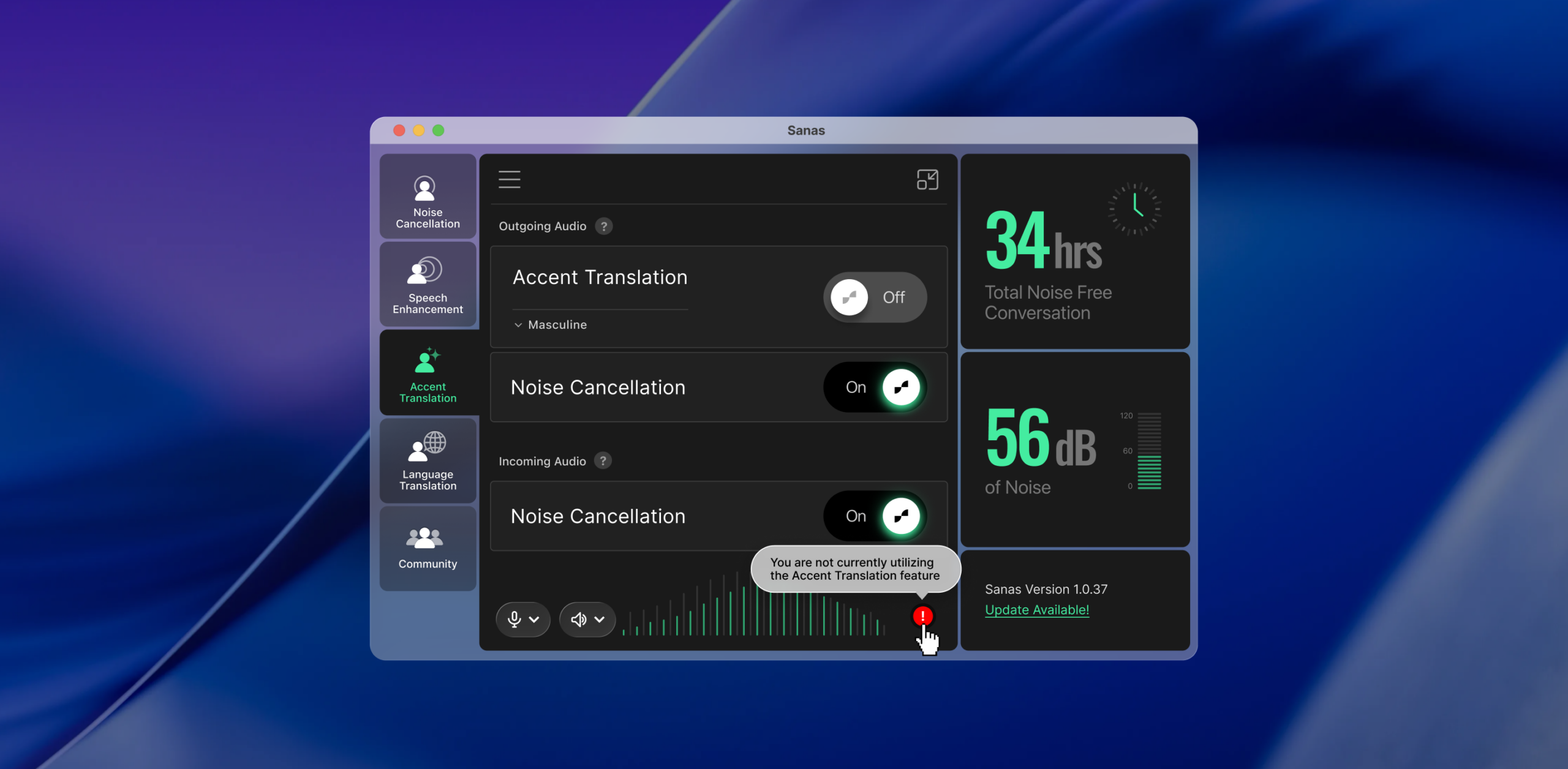
Alongside my work on the Sanas brand, I explored aspirational visual directions for the company’s future mobile experience. Rather than designing a fully realized application, the goal was to establish a creative point of view, exploring how the brand’s personality, visual language, and interaction principles might translate into a more expressive product experience.
These early explorations were intended to serve as inspiration and directional guidance for future product designers, offering a starting point for further development rather than a prescriptive set of finished screens.
Mobile experience: future vision – aspirational visual direction and exploratory design studies. Early creative explorations act as reference material to inform future product design, not finalized application screens
Big ideas depend on the smallest details.
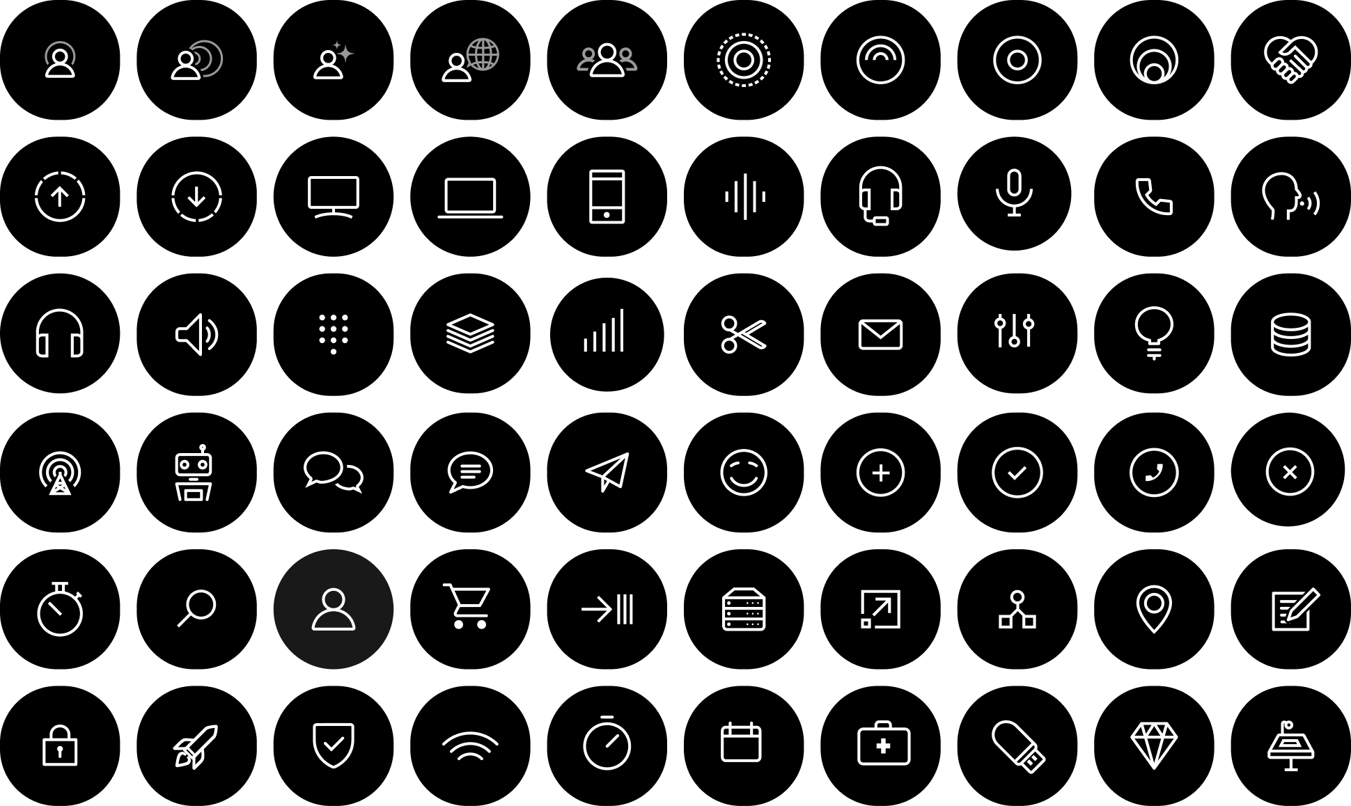
An extensive family of 60 icons brought consistency to the way Sanas communicated everyday concepts. Each needed its own clarity and character while remaining part of a recognizable visual system.
Clarity, even in the smallest details.
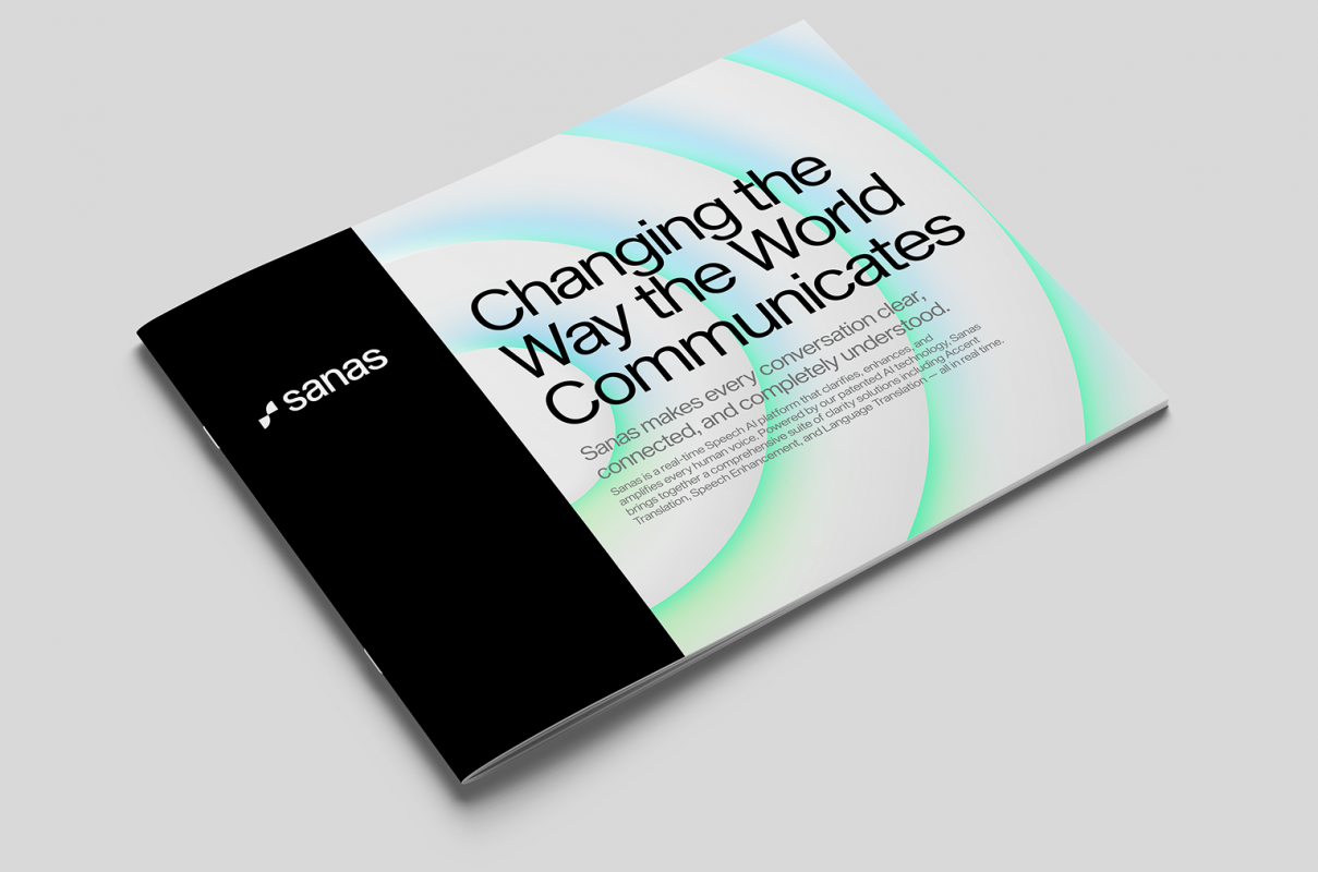
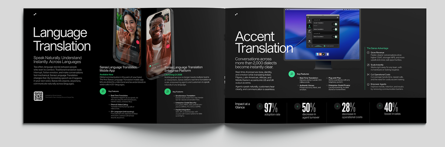
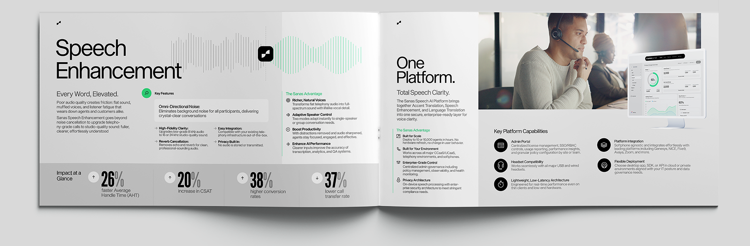
Some of the most important brand experiences are the materials people use in everyday conversations with customers, prospects, and partners.
I designed a 13-page product brochure alongside supporting sales communications, translating complex product information into formats that were approachable, organized, and visually consistent. These applications called for a more restrained expression of the identity, balancing typography, information hierarchy, and visual storytelling to make the material both useful and distinctly Sanas.
Sometimes the most powerful explanation is a demonstration.
For a Language Translation demonstration, I developed storyboards and provided art direction for an animated piece designed to make the technology feel immediate and accessible.
The work involved shaping the progression of the narrative, deciding how to introduce and communicate the product capability, and establishing a visual approach that balanced explanation with energy and personality. By connecting the story, motion, and visual identity, the animation helped communicate a complex idea through a more intuitive experience.
The work of building a brand is never really finished.
My time at Sanas reinforced something I’ve come to value throughout my career: the strength of an identity isn’t measured solely by how compelling it looks when it’s first introduced, but by how thoughtfully it continues to evolve.
From developing practical guidelines and extending the visual system to art directing motion, creating physical brand experiences, and collaborating with product designers, the work demanded a balance of creative vision, adaptability, and attention to detail. For me, that balance between setting direction, delivering thoughtful work, and helping others do their best work is central to effective design leadership.