Keeping a brand fresh without losing what makes it recognizable.
Through TechGrayscale, I led a multi-year creative partnership with Fitbit Health Solutions, shaping and evolving its B2B visual language across editorial design, digital campaigns, print, and motion.
Working within established brand guidelines, the challenge was to keep the work feeling current from year to year while maintaining the consistency and recognition of the Fitbit brand. Each initiative presented new audiences, content, and communication needs, creating opportunities to extend the visual language without losing its identity.
One brand, many different stories.
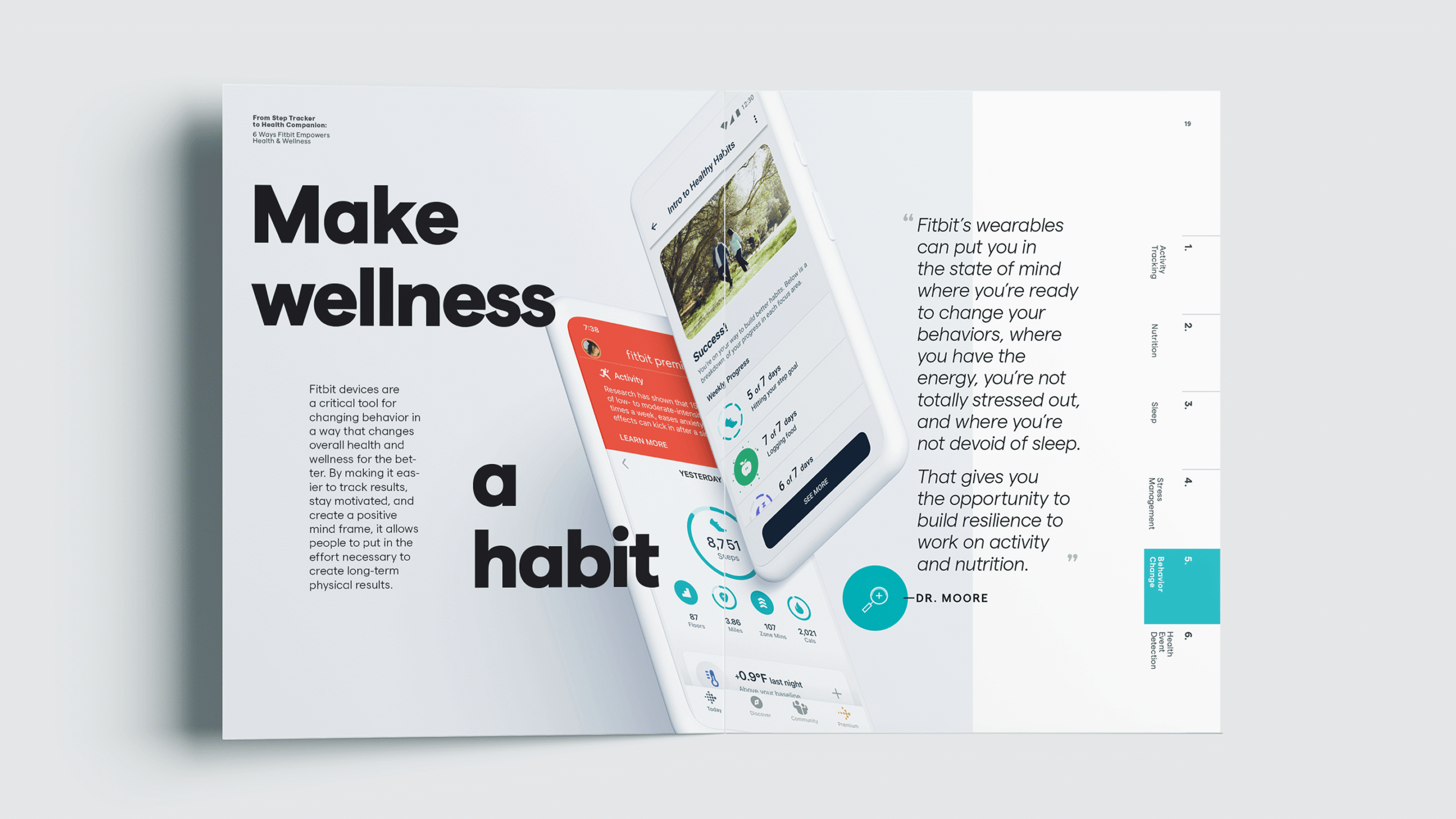
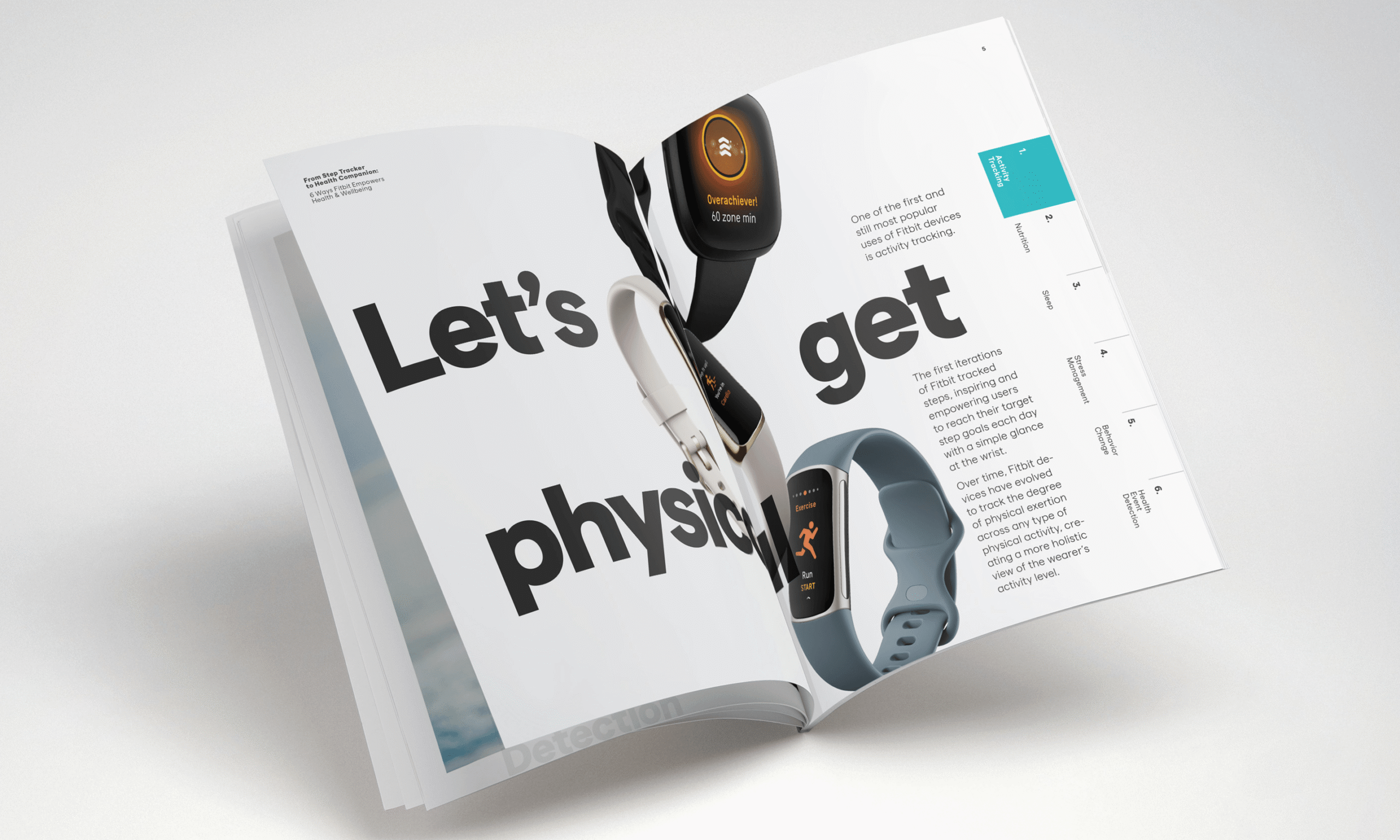
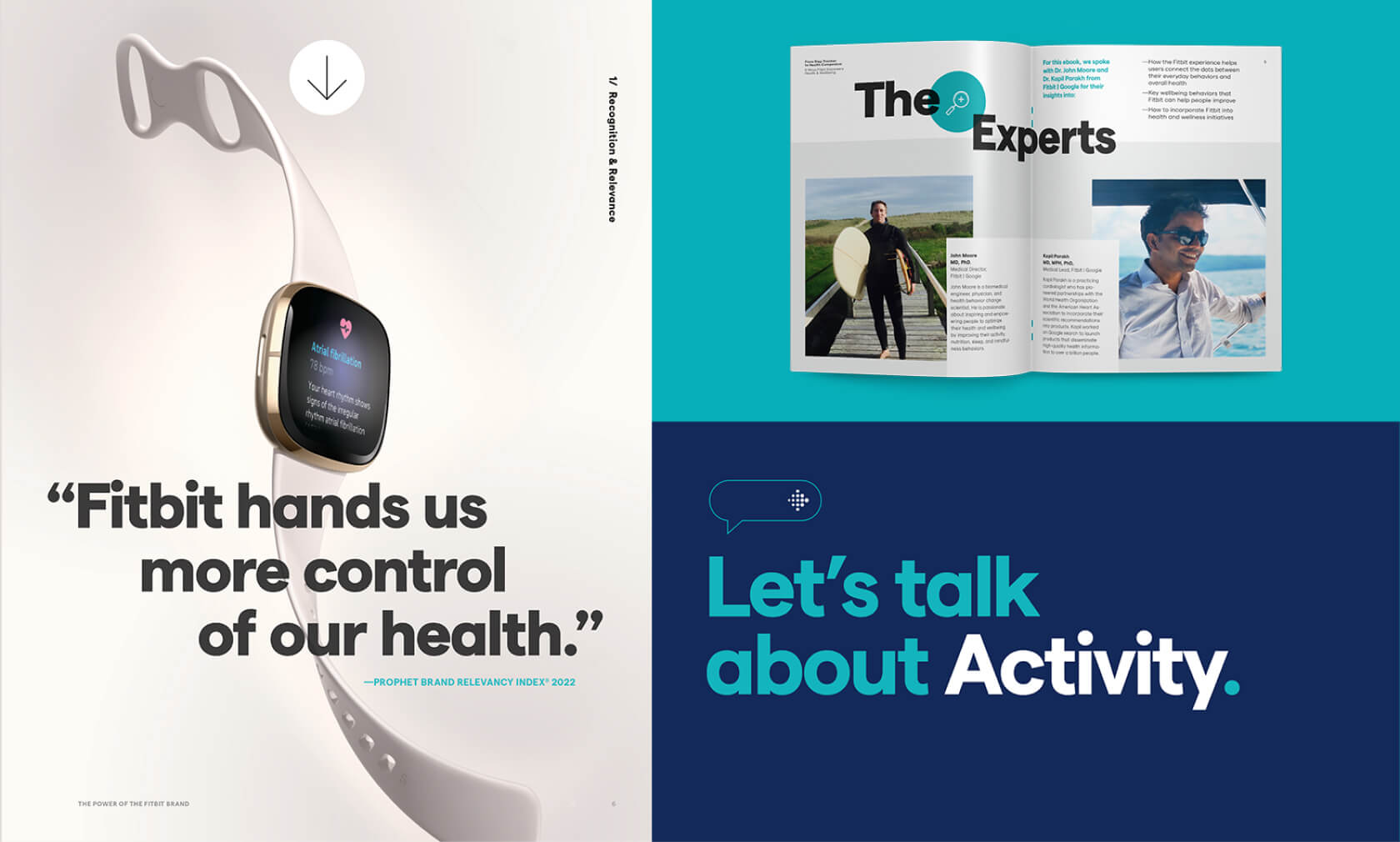
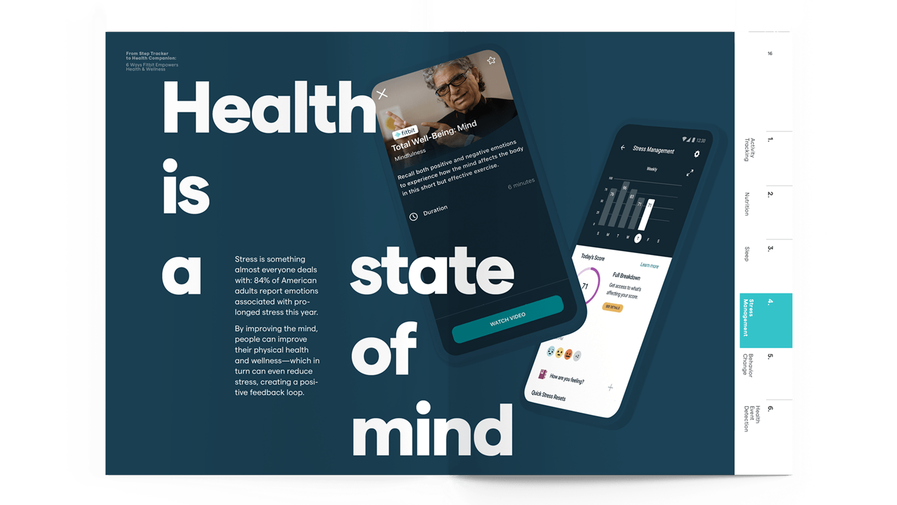
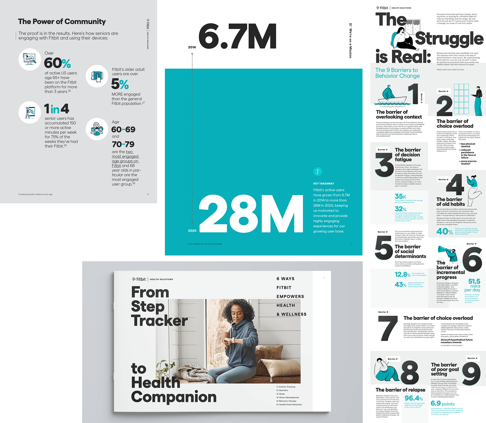
Across ebooks, white papers, and campaign materials, the work had to make a broad range of healthcare subjects accessible to a predominantly B2B audience.
Each project called for its own visual approach, while remaining recognizably part of Fitbit Health Solutions.
Making a complex brand system easier to navigate and apply.
Working from a supplied content outline, I designed and developed a comprehensive brand guidelines document for Fitbit Health Solutions partners.
The challenge was organizing detailed brand standards into a clear, accessible reference that partners could use in their own communications.
Through typography, layout systems, visual hierarchy, and carefully structured examples, the guidelines brought together co-branding requirements, color, photography, graphic elements, and messaging into a cohesive resource.
Selected spreads from the Fitbit Health Solutions Partner Brand Guidelines. Document design, layout system, visual organization, and production.
Making complex information clear is as important as making it compelling.
Extending the visual language into motion.
Animation created opportunities to communicate brand themes through pacing, music, typography, and graphic elements.
For Fitbit Health Solutions’ quarterly business review, the presentation brought these elements together in a more expressive format.
Quarterly business review animation using animated typography, playful glyphs, and music to communicate brand pillars.
Selected animation storyboards illustrating how Fitbit Care could communicate the value of health data and introduce personalized coaching through the Fitbit Health Solutions experience
Building consistency while making room for change.
Over the course of our partnership with Fitbit Health Solutions, the work evolved alongside the brand itself. New initiatives, audiences, and communication challenges called for different creative approaches, but each needed to feel connected to a larger, recognizable identity.
My role was to provide creative direction and continuity across that work, finding opportunities to introduce fresh visual thinking while respecting the established brand system. From editorial design and partner guidelines to campaigns and motion, the goal was to make each new expression feel distinct without feeling disconnected.
It’s the kind of long-term creative partnership I value most, where understanding a brand deeply creates more opportunities to push it forward.